Tools play a crucial role in research and the visual representation of regions. In this piece by Dr Jakob Eder, we explore mapping (graphicacy) and discuss its application and potential improvements for presenting research.
Let’s face it: as geographers, we know that maps are a powerful tool to communicate findings, but many maps out there are simply not well designed. Humans are visual beings, and much better at processing data visually than in large tables. However, flawed maps can lead to false conclusions or quickly lose the reader’s interest, or they may even become difficult to understand.
There are two main reasons for this. First, today, everyone can make maps. While this required sophisticated expertise some decades ago, free software like QGIS or Datawrapper is now readily available. Second, visual education is often valued much lower than other skills. During my studies, I can only remember one course on thematic cartography where a professor questioned the 3D effect of my charts or where colour schemes were discussed. This indicates how rarely we reflect on what makes visualisations easy to understand.
Geography as a visual discipline
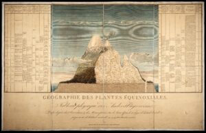
It is a pity that this is common in many geography departments, as the discipline has a long tradition of visual communication. For example, Alexander von Humboldt is often referred to as the first geographer because of his integrated thinking. He was also a great science communicator. In 1807, he drew a cross-section of Chimborazo — Ecuador’s tallest mountain — to illustrate the discoveries from his expedition. In that sense, geography can claim the first infographic of academia.
In addition, in 1966, geography teachers William Balchin and Alice Coleman coined the term graphicacy. It highlights the skills necessary to draw and to understand maps, charts, and sketches. The idea was to underline the importance of these skills in addition to the established concepts of literacy and numeracy. Early cartographers and statisticians were indeed experts in their fields, developing most of the mapping techniques still in use today before 1900. For those interested, the Statistical Atlas of the United States from the census of 1870 provides fascinating historical examples.
Five considerations for better maps
Some of this tradition is still visible today. Maps and charts are often included in publications, partly because there is a sense that geographers are expected to do so. Indeed, there is no better way to communicate spatial data than on a map, but these tools are not always used to their full potential. As a reviewer, I sometimes try to give constructive feedback on how maps might be improved. Unfortunately, it sometimes happens that authors then decide to remove their maps from the paper, shying away from the challenge of improving them.
This is a missed opportunity, since relatively small adjustments can make a map much more effective. The following five considerations may serve as a starting point:
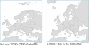
- Show proportions realistically: There will always be distortions when converting the globe to a flat map. Luckily, cartographers developed tailor-made geodetic reference systems or projections for different purposes, minimising these distortions. For example, the World Geodetic System 1984 (WGS84) is the global standard for GPS navigation, but not a good standard for maps. For Europe, ETRS89 is preferable. For other countries or regions, one can search for “country/region projection epsg” to get suggestions.
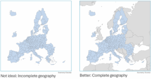
- Avoid imaginary geographies: Having data only for certain regions is fine; other regions can be shown with “no data” rather than being omitted. Making countries disappear is not only incorrect but also insensitive to people living in them (ask New Zealanders about it).
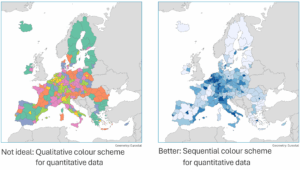
- Use colours that match the data: Most often, when one shows a map that uses quantitative data, a single-hue scheme with light shades for low values and dark shades for high values allows the audience to grasp the map even without a legend. And bipolar colour schemes should be reserved for diverging data, such as population growth versus decline. Qualitative colour schemes are suitable for categorical data, such as types of regions, but not for quantitative data. Resources like Color Brewer 2 offer useful guidance.
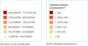
- Design legends for clarity: There are many ways to classify data, and legends are used to provide clarity on a map for data representation. Therefore, legends should include basic information on the data shown, use rounded numbers where possible, and indicate both the variable and its unit.
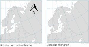
- Be cautious with north arrows: North arrows are crucial for large-scale maps like city plans or plots, especially those not north-oriented. However, small-scale maps are usually north-oriented and hence, north arrows are not necessary as the cartographic projection often distorts directions. As the gridlines show below in the example, north is rarely where the arrow points.
Creating high-quality maps is a challenge, but it is one worth embracing. On the one hand, researchers have a responsibility to produce accurate maps. On the other hand, maps are a powerful tool for science communication, helping to convey results not only to other scientists but also to a wider public. For those new to map-making, resources such as Datawrapper’s Academy or QGIS tutorials offer accessible ways to begin. And as the examples above show, making some major improvements to the maps is easy. As such, I hope these suggestions inspire everyone to improve personal graphicacy – it’s worth the effort.
Additional References
- Brewer, C. (2016): Designing Better Maps: A Guide for GIS Users. Redlands, CA: Esri Press.
- Graser, A. & Peterson, G. (2016): QGIS Map Design.
Connect with the Author

Jakob Eder is a lecturer at the University of Vienna. His research focuses on innovation in peripheral regions and regional development. In recent years, he has developed a strong interest in data visualisation and science communication.